Zenseact
Website design for the software and AI company Zenseact.
A new website for the software and AI company Zenseact, where the design process was focused on striking the right balance between serious and vibrant, and making their identity feel dynamic despite the modularity of a website.
The starting point
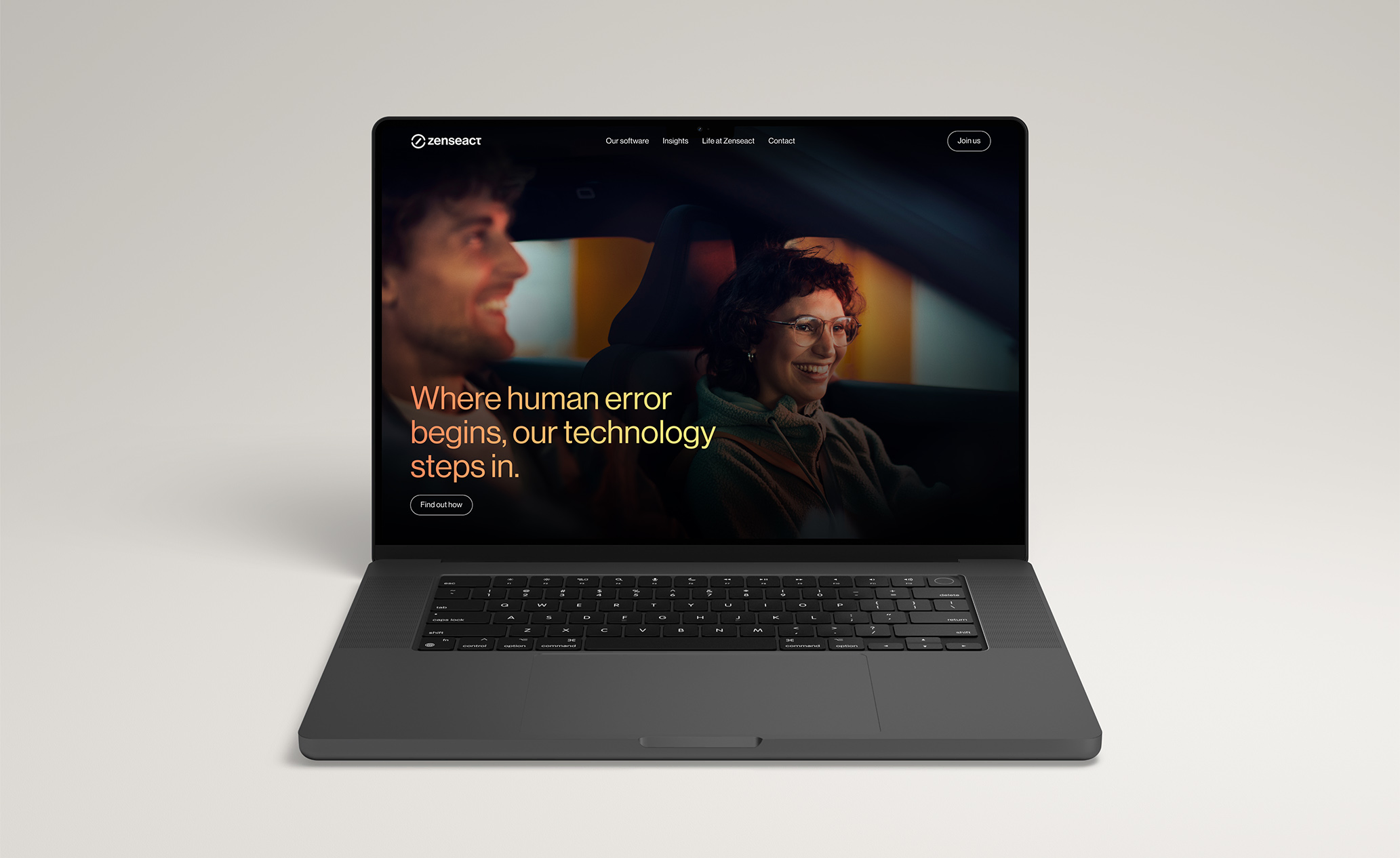
In late 2024, I joined a project as lead designer to create a new website for Zenseact. The old site didn’t reflect their identity or needs anymore, which meant it wasn’t being updated or used to its full potential. And who is Zenseact? Well, if you’ve seen the intelligent safety features in cars like the Volvo EX90, you’ve seen Zenseact’s software in action – they create the advanced driver assistance systems (ADAS) for Volvo Cars and Polestar.
Interpreting a dynamic visual identity
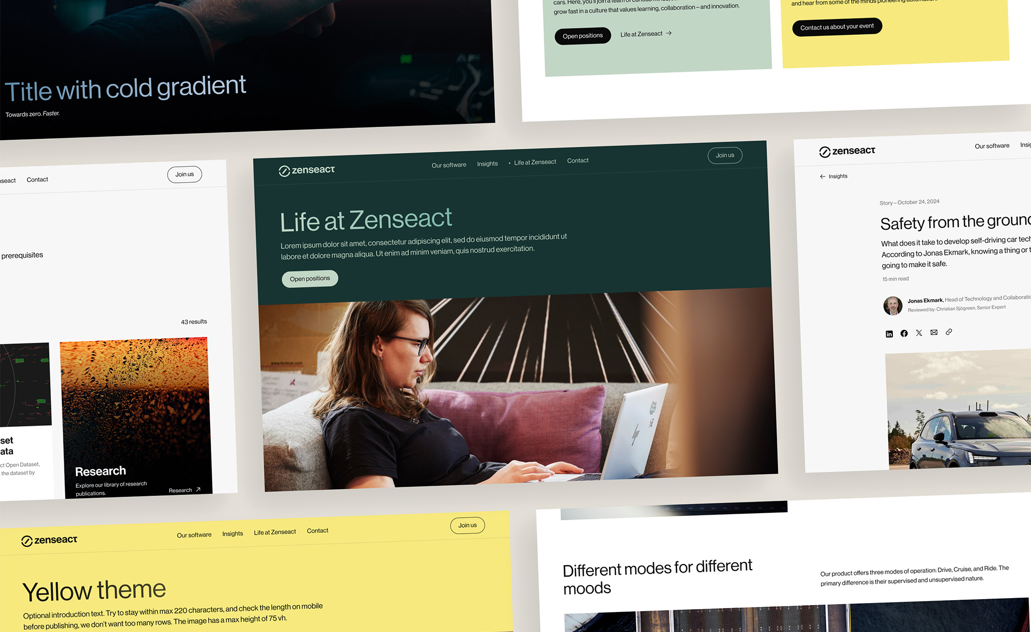
Before starting any design work, I met with their team to get a better understanding of their brand identity, and learned that it’s built on a few important core principles but also dynamic and open to interpretation. As a designer I admire brands that successfully allow this type flexibility, and execute it well. And this time it was my responsibility. Taking care of this identity in a way that makes sense in the digital landscape where we have technical limitations and accessibility to care about – and most importantly, keeping the amount of choices for editors to a minimum – meant I had to experiment.
Finding the right balance between color and neutrals, bright and dark, bold and minimal was an iterative process. And since websites are modular and template-based by nature (at least if they are going to be scalable and easy to manage), which is the opposite of dynamic, part of the solution was to get creative with the details.
Turning culture & values into design choices
Zenseact is a technology company in the automotive industry, whose software can literally be the difference between life and death. This calls for a sophisticated and serious design. At the same time, they have a strong company culture, making them a vibrant, diverse, and inspiring place to work that stands out in the industry. Since attracting the right talent is one of the website’s main goals, this angle was equally important to take care of.
The details make the difference
These are a few of the design choices and small details that helped create the right overall impression:
- Color themes: A curated selection of themes that create variety without overwhelming editors.
- Monochrome color combinations: Creates a soft and friendly look, while maintaining high contrast.
- Subtle gradients: Can be activated on main headings to add a touch of personality.
- Micro-animations: Adds a hint of playfulness, but also a premium feeling.
- Moments of delight: Small, unexpected details like the tomato sticker in the footer.
- Oversized headings: Creates a playful contrast with the otherwise serious typeface.
- Space for imagery: Letting powerful visuals speak for themselves and add color.
See more for yourself at zenseact.com.